

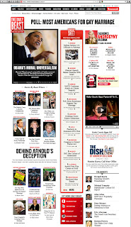
 A few months ago I wrote about the enormous potential I see for the future development of the iPad. For those of you who haven't read the post, I'll summarize. That device has changed my expectations for the web. It seems that tablets have created a platform that is satisfying on more levels than a simple desktop or laptop computer. Up until now, the experience of using the Internet instead of traditional print materials has been an exercise in give and take. Sometimes better, sometimes worse. It's easier to find information and there's much more of it, but we've been forced to accept a degraded level of enjoyment, satisfaction and ease of use.
In my article, I compared CNN.com's home page to that of the Daily Beast. CNN is simply a list of headlines, similar to a table of contents and not any more interesting; The Daily Beast is buffet of visual information organized into a clear hierarchy which uses images to quickly communicate. Quality of content aside, these are two totally different approaches to delivering the news.
 A few weeks ago, CNN launched a beta version of what they're calling their Tablet View which is a version of the site that is re-imagined to present the news in a more visual way. The articles are presented with an image and headline, arranged from most important in the larger column on the left to least important in the smallest column on the right. When you select a story, it pops up and allows you to read a portion of the article, click through to the full story, or go to the next one.
For those of you familiar with Flipboard, Taptu or The Daily, you'll notice that CNN's tablet view has taken a page out of their book. One of the significant features of these apps is their ability to give you a quick idea of an article without bogging you down with too much content, until you're ready to commit. It reminds me of the front page of a traditional newspaper. Short blurbs of multiple articles, and you have to turn the page to finish reading. Flipboard does this perfectly and it also allows you resize and organize these articles within your board (see a video of this in action). Why did we have to come so far to return to a concept that has been in use for decades?
The CNN version is still in beta, and you can tell. It appears they tried to implement a new system without considering if the content will actually work in the new layout (one stock chart would be more than enough, thank you very much). The design and implementation is not in the same league as Flipboard or the other apps, and I would guess CNN developed this as a proof of concept, not a fully-fleshed out design. If not, CNN please give me a call. We need to talk.
The significance in CNN spending resources to investigate this approach is that it validates the idea of a paradigm shift in our expectations for web-based experiences, and therefore what we as designers/developers need to consider. It seems the collective expectation is that everything should be more interactive -- or experiential -- and offered to us in a manner similar to the offline world. And we are just now becoming capable of delivering on that demand. Just imagine if you walked into Barnes & Noble to buy a magazine and they simply handed you a list of titles and didn't allow you to browse through the covers with their beautiful, glossy photos and flashy headlines. Would you buy anything?
As humans we're susceptible to the emotions brought on by images and colors. Over the years we've grown to crave this stimulus and the online world has struggled to deliver that emotional payload, and has suffered for it. Online advertising rarely garners the prices that print ads command. This shift represents a move toward a more emotional, and therefore satisfying, experience on the web. I believe this will usher in a new era where you can find multi-sensory experiences through technology that are as satisfying as their tangible, offline counterparts. It might not happen overnight, but I feel like we now know what we've been working towards.


